whisky 1901
Infusing an established whisky investment brand with fresh flavour. How a sophisticated new logo and visual identity helped Whisky 1901 connect deeper with its investors.

The back story
Nestled at the intersection of financial acumen and Scotch whisky passion, Whisky 1901 stands as a beacon in the world of whisky investments. Armed with decades of financial expertise and a profound understanding of market dynamics, the London-based company has a profound commitment to delivering consistent year-on-year growth for its esteemed clientele. Their vision is clear – to ascend to the summit of the whisky investment industry.
Their team approached branded by berkeley with a brief to refresh their current branding so it more accurately reflected their mission to connect with their investors.
What we did
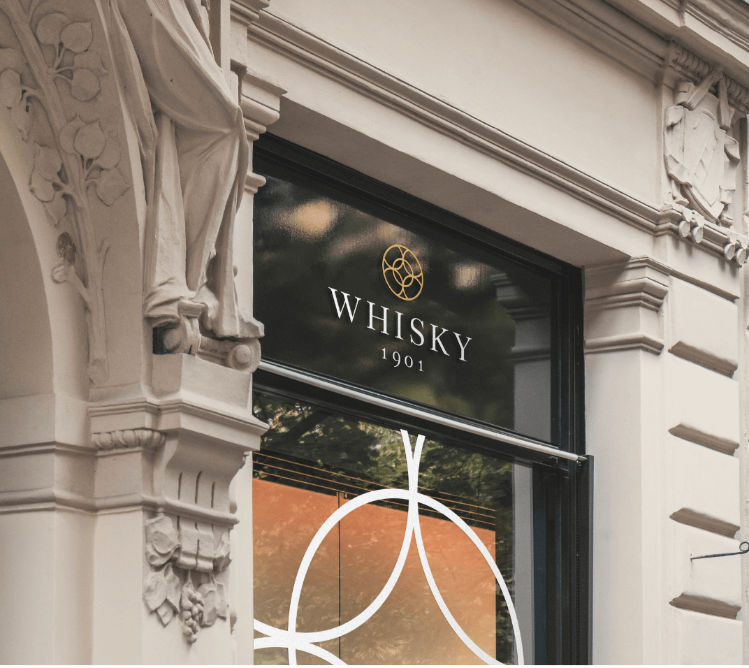
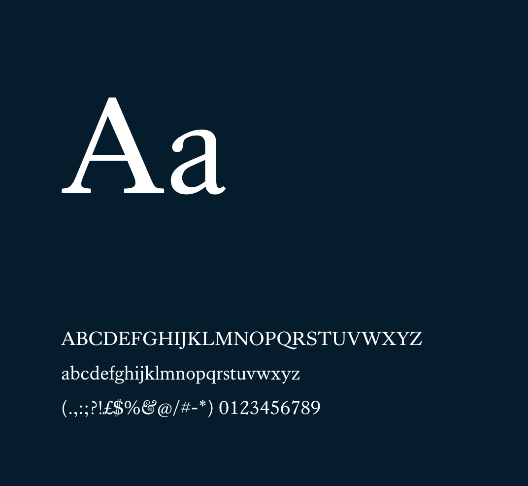
The initial challenge was to align the visual representation of the brand with its core mission of establishing meaningful connections with investors. Following a process of detailed research and ideation, the branded by berkeley team proposed a simple but sophisticated logo solution. The marque consisted of a circle pattern representing the six hoops on a whisky barrel, paired with a classical serif typeface to reflect the traditional values of investment companies and their experience in the industry.
LEAD DESIGNER’S THOUGHTS
We worked collaboratively to revive timeless elements while infusing the brand with a fresh yet reverent perspective.Get in touch

The new identity
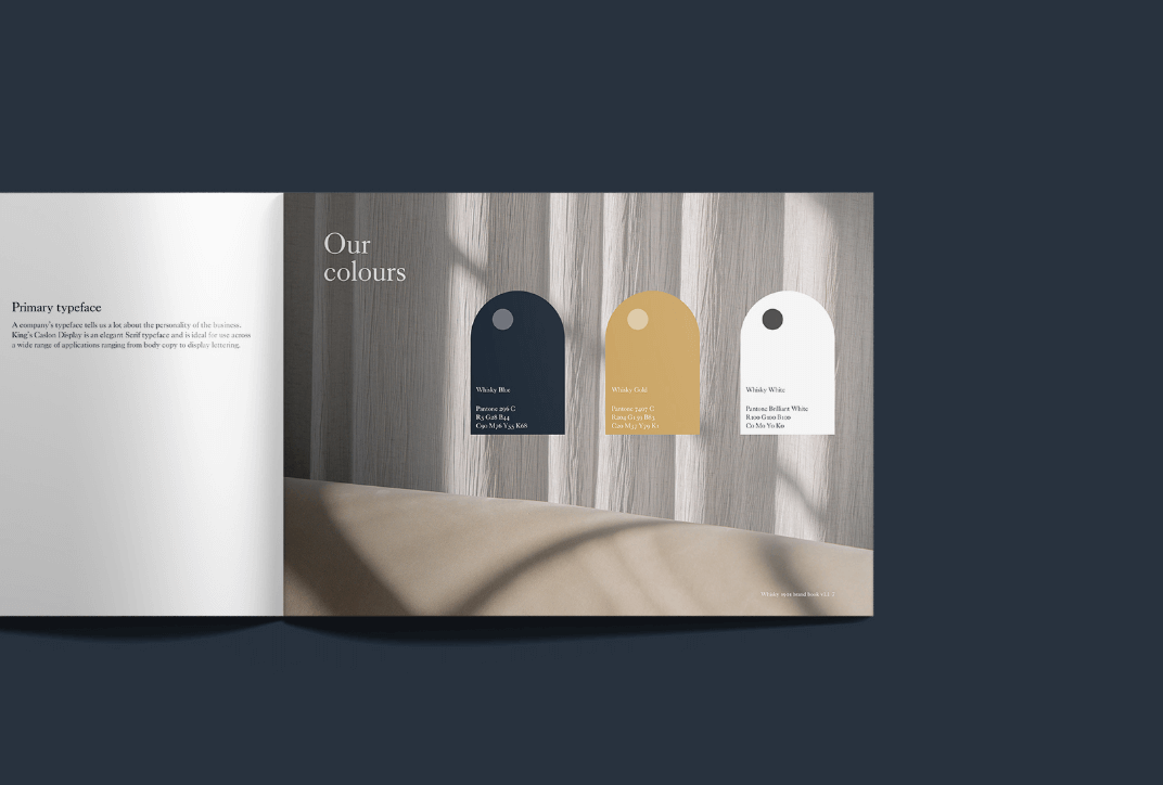
Continuing on from the creation of the logo, the branded by berkeley created a series of brand assets to support the refreshed identity. This included an investors’ guide incorporating elegant typographic styling alongside sleek imagery to mirror the key characteristics of the target audience and the company’s desire to create a safe haven for whisky investment. The sophisticated and classical styling created a sense of trust in the brand, supporting current and future clients on their investment journey.
branded by berkeley graphic designer Hannah Bailey explains, “Thanks to our meticulous process of research and ideation, we were able to create a logo that transcends simplicity and sophistication. The infusion of sophistication and classical elements instils a profound sense of trust, guiding both existing and future clients on their investment journey.”
The story continues
The branded by Berkeley team remains steadfast in their support, an ongoing partnership that extends beyond the initial transformation. As Whisky 1901 evolves, so does its visual narrative, a story that unfolds with each design requirement met by the creative minds at branded by berkeley.

Aaron Sparkes
Founder and managing director
Whisky 1901
We needed a logo that stands out and resonates with a new generation of whisky investors while retaining the trust and expertise that Whisky 1901 is known for. The branded by berkeley team has done an exceptional job in visualising our distinctive identity while encapsulating our commitment to providing a safe haven for whisky investment. We continue to work together on further marketing and digital enhancements.


